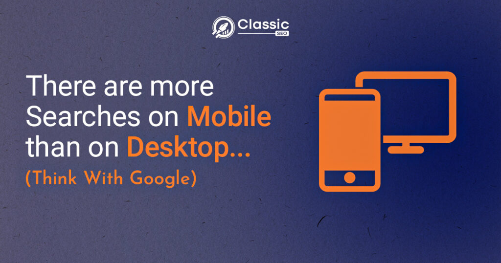
You may have come across the term mobile SEO. But, have you ever wondered what it is? And why is there so much fuss about it? Before discussing what mobile SEO is, let me tell you an astonishing fact. According to studies, around 54% of users use the internet through their mobile phones. Yes! The number is big, and this rate will elevate further in the coming times. It shows how essential it is to optimize your website for mobile devices as most people use them to search for business and service providers online.
SEO for mobile devices is crucial if you want your audience to reach you as much as possible. Today, we will talk about mobile SEO, what it is, why it is crucial, and how you can improve the mobile SEO of your website. So read on to learn all about mobile SEO.reach businesses like yours.
What is Mobile SEO?
Mobile search engine optimization involves optimizing your website for mobile devices. Earlier search engine optimization’s primary target was to attract desktop site users. But it is no more the case as more than half of your targeted audience is now using mobile phones to reach businesses like yours. So if you don’t want to miss out on this large chunk of the audience, then it/s better to get started with an efficient mobile SEO strategy.
Why is Mobile SEO Important Now a Day?

In the past decade, people usually used the internet through desktop computers, etc. But, with the revolution in mobile phone technologies, smartphones have become immensely popular and readily available for everyone. As a result, many internet users switched to mobile phones for using the internet. That is because it’s more convenient, accessible, and time-saving. According to recent statistics, more than 54% of internet users now use their mobile phones to search online, and this number is readily increasing. It is why search engine optimization for mobile devices is crucial these days.
What is Google Mobile-First Index Mean?
Mobile-first index means that Google prioritizes those pages for ranking and indexing which are optimized for mobile versions. Also, the mobile version of your website is considered to be the primary version of your website. Previously, Google considered the desktop version the main version, but now it has made it clear that the mobile version of any website will be used for ranking and indexing.
How to do Mobile SEO?
Mobile SEO is a significant factor to consider if you want your website to rank better in SERPs and attract organic traffic. But, it’s not a simple job as it involves various techniques and strategies that can ensure better results for your SEO strategy. Here are some essential pointers to remember while designing a mobile SEO strategy
Choosing Mobile Configurations.
The first step towards mobile SEO is setting your mobile configuration Google’s favorite ns. There are three types of configurations you can choose from. Let’s have a look at them and their respective pros and cons:
Responsive Design
The number one configuration is responsive design. This design will use the same URL and HTML for both web and mobile versions. This design is recommended the most as it uses the same JavaScript and CSS images for all devices.
Dynamic Design
The following design is dynamic. The URLs for both mobile and web design are identical in this design, but HTML is different for both versions. Therefore, it is not usually recommended as it uses two HTML for a single webpage.
Separate URLs
The third approach to mobile configuration is separate URLs. In this approach, the server sends different URLs and HTML according to the device. However, this approach is not Google’s favorite as it makes the google bot make an extra effort to crawl two websites.
Website Speed
Website speed is one of the most crucial factors for mobile SEO as one thing is evident that no one like to wait in these modern times. Furthermore, statistics show that most users tend to leave your website if it takes more than 3 seconds to load. Therefore, you need to pay special attention to your mobile site speed.
Meta Tags Optimization
Meta tags are like the first impression of your webpage on your customers. It is why you need to be extra careful with it. Optimizing meta tags for mobile versions is as vital as in the desktop version. Make your meta tags catchy and witty, and carefully incorporate the right amount of keywords.
Readability of Content
SEO is nothing without quality content. Ensure that the content you are providing for your users is informative and engaging. Your content must address all the questions your users might have. With that, it should also be readable on mobile devices. Ensure the readability of your content is not affected by the devices your users might be using.
Blocking JavaScript, CSS, and Images
Google doesn’t recommend hiding your JavaScript, CSS, and other related files from search engine crawlers. As it doesn’t allow the Google bots to crawl your website fully. So blocking JavaScript, CSS, and Images is no longer recommended for the perfect mobile SEO plan.
Interstitial Popups
Interstitial popups might be an excellent way to increase your conversion rate. But, with smaller screens, Google doesn’t recommend it that much on mobile devices. So, what to do instead? Instead of using conventional interstitial popups on mobile devices, you can use small banners, app install banners, app indexing, etc.
Negative Space
Negative space refers to the space between designs, text, or CTAs on a webpage. It is crucial to leave more negative space on mobile devices where the screen is much smaller than the desktop. It ensures that users can quickly and conveniently click the button of their choice.
Social Media Sharing Icons
Social media icons on web pages can bring you extraordinary outcomes. But, it is better to share the social media icons at the bottom of the webpage on the mobile version of a web page, contrary to the desktop version, as it leaves more space for the users to scroll down.
Implementing AMP
AMP, aka accelerated mobile pages, was developed by Google. It helps in the faster and smoother loading of a mobile page. Google displays AMP with mobile pages that load faster. Users tend to pick pages with AMP more, so implementing AMP can benefit your ranking indirectly.
Fixing Faulty Redirects and Cross Links
Redirecting involves directing your users to another page. It is essential for an efficient SEO plan to redirect your users to the right and relevant pages. Faulty redirect can end up losing a potential customer. Similar is the case with cross-links that link your website to another website. Make sure that you are connecting to relevant sites.
Control 404 errors
The user often gets the error 404 on the mobile version of the website, which serves them perfectly on other desktop devices. It usually occurs in the cases where the users are using the same URLs for both versions. You can redirect the users to mobile URLs to solve this problem.
Use “”Vary”” user agent
“vary” user agent helps inform Google which version of the website to use depending on the user’s device. For instance, if the user is using a mobile device, the various user agent in the HTTP header will tell Google to use the mobile version of the website the user is searching for. It helps significantly in serving the needs of the users efficiently.
Meta name= viewport tag
Viewport tags come in handy when you are using a responsive design. It helps the browser scale the width and length of the page according to the device the user is using. Therefore, it is pretty beneficial for the ranking of your website. On the other hand, not using it might affect your ranking as the browser may scale the desktop version of your website on a mobile device which won’t turn out well.
Tools Used for Mobile SEO
It is now established how essential mobile SEO is for the better ranking of your website and, ultimately, for your business. Various tools can help you in mobile SEO. Let us have a look at a few of them.
Google mobile-friendly test
Google’s mobile-friendly test is an excellent tool that shows how effective your website is on mobile devices. You have to enter the URL, and this tool will show you how mobile-friendly that particular webpage is. It’s a fantastic tool to analyze where you are standing in terms of mobile-friendliness
Google page speed insight tool
Google page speed insight tool is a super cool tool as it gives you a clear picture of your website’s speed. So, you know where you are standing. But its awesomeness doesn’t end here, as it also gives you suggestions through which you can improve your website’s speed and can ultimately benefit your page ranking.
Fetch as Google
Fetch as Google is another valuable tool by Google that helps you understand how to google index your page or if it’s missing something important on your page or not. You have to enter the URL of your mobile page and check out how Google perceives your page.
Schema
You can create structured data for your mobile site using this helpful tool. This structured data helps the search engine understand what your page is all about.
Conclusion
That was all about mobile SEO, what it is and how essential it is for a comprehensive SEO plan. We also discussed some helpful tips and tools that can help you make your mobile SEO plan more comprehensive. We hope that you can improve your ranking on search engines and ultimately boost your business by using these insightful techniques.
Source: Youtube